A collection of various GIS related links, information and other GIS blogs.

Friday, October 31, 2008

SANDAG GIS team – winning awards!

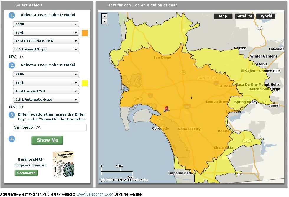
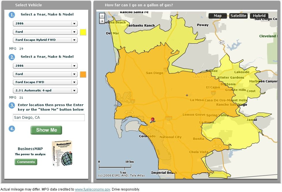
Longtime GIS users, the San Diego Association of Governments (SANDAG) has a lot of experience in doing GIS-based analysis for aiding in decision-making and making a lot of maps.

Recently some of these maps have won some awards (read about it here)!

And here are PDFs of the maps:

2007 San Diego Wildfires: Half a Million People Evacuated (Where did that number come from?)

Downtown San Diego - 2030 Commute Cost Analysis: How much do you really pay to get to work in the morning?

Visit the SANDAG website to learn more about how they use GIS technologies and to download free San Diego area data.

Saturday, October 11, 2008

How far can YOU go on a gallon of gas??

Here's a fun way to find out. Take a look at this demo site called MapMPG (beta). This is based on Business Map (with fuel data from http://www.fueleconomy.gov) and takes your input information on the make, model and year of two cars, and a choice of locations - and gives you a map of how far those cars can drive.

Might be a good tool to use when thinking about new cars.

For example - if we had purchased a Hybrid Escape a few years ago instead of the 2WD, I would be getting about 8 MPG more...

This shows our 1998 F-150 and out 2006 Escape (click for full size):


We thought about getting the Hybrid, but just couldn't swallow the extra cost. Of course, gas was a lot cheaper back then too. Here's the distance of the 2WD gas versus the 2WD hybrid (click for full size):


For more information on BusinessMap, go to: http://www.esri.com/software/busmap/index.html

Mapping Center : I remember making this feature class...I wonder why?


I remember making this feature class...I wonder why?

Have you ever wondered where a feature class came from as you've browsed over one of your geodatabases in ArcCatalog? I think most of us have, and probably more often than we'd like to admit. In the example shown here to the left, I made these datasets a few weeks ago, and I have no idea what "GN" means, and if or how I selected, simplified, or dissolved the data.

There are a couple of things we can do to avoid that puzzled feeling: standardize your feature class naming convention; standardize your geoprocessing.  With the naming convention, I started doing the right thing here, but failed to follow through and leave myself the necessary clues. The data in the image above was also the result of a complex workflow, so rather than start with that, let's cover the basics. 

Use Standard Feature Class Names

My example here fell apart because I was using the framework for a standard naming convention, but my naming convention  wasn't entirely standard. The framework that I was using creates feature class names based on who first published the data, and then what the data represents.  So, NHD_Flowlines means I got the data from NHD (USGS National Hydrography Dataset), and the data represent stream flow lines.

Second, while my example started off with a good name, I had not developed a standard convention for any of the processes that I ended up doing to my NHD_FlowlinesPlus dataset to produce my cryptically named datasets.  Before I explain what I should have done, I'll share the standard naming conventions I use:

  • Scale: _24K, 100K, 250K, 1M, 2M:  The first example means the data are either captured or generalized to be at a resolution appropriate for 1:24,000 scale maps.  The 1M means 1:1,000,000.  This is a relatively good convention; I say relatively, because the meaning is map product and data-production specific.  The product in this case is an on-screen map, and I use different data production methods from that which I would use for a printed map.
  • Mapping Purpose: _lab _sym, _master:  This refers to how I use these data in a map. If it is for labeling only (_lab),  for symbology only (_sym), or a dataset that I use to derive cartographic data, (_master). The context I have found most useful to use these abbreviations is ArcGIS Server, my goal there is to optimize the data to the greatest extent possible to improve drawing performance.  I covered how to set that data up in a recent blog entry on tips for improving drawing performance.
  • Vintage: _03, _07, Mar_08, Jun_06, etc.:  This is just a two-digit year so I can tell when data are captured. For imagery, it's useful to add at least the month or even the capture date to the name as seasonality often carries significant meaning.

Read More: Mapping Center : I remember making this feature class...I wonder why?

Mapping Center : Color ramps reorganized

Tuesday, May 13, 2008 6:00 AM - Jaynya

Color ramps reorganized

We recently made some changes to the color ramp styles on Mapping Center under the ArcGIS Resources tab. You will now find a single ZIP file that contains a variety of color ramps. Our purpose in reorganizing the color ramps was to make it easier to find and use the color ramps.   The way we did that was to organize all the color ramps of a particular theme into a separate style file.  Then we gave each of the style file a name that better describes the purpose of the color ramps.

The .zip file contains color ramps for the following:

  • Desert environments
  • Hypsometry (elevation) developed using Imhof’s guidelines in Cartographic Relief Presentation
  • Special cartographic effects (like the park boundary used on the Crater Lake National Park map)
  • Special events (fire, global warming)
  • Water bodies
  • Water dynamics (water currents – direction and velocity)
Click on any of the images below to see a full-size version of the contents of each of these styles:

 Desert Color Ramps - Click to see full size Effects Color Ramps - Click to see full size Events Color Ramps - Click to see full size

               Desert                               Effects                                  Events

Read more: Mapping Center : Color ramps reorganized